Top 4 Data Visualization Tools for Business Intelligence Work: 2026 Guide
Today’s topic is the Top 4 Data Visualization Tools for Business Intelligence.
Business intelligence is the process of turning raw data into clear insights that drive smart decisions. The very best data visualization tools should by design make this very easy.
Piggybacking on a prior post comparing Excel to Power BI, there comes a point where the visualization capabilities of Excel are not enough and you need to graduate to a true data visualization platform.
I can tell you that choosing the right platform matters a lot. Not all tools are created equal. Additionally, making a bad decision at the outset can lead to a lot of wasted time and money.
This guide covers the Top 4 Data Visualization Tools taking into consideration things like ease-of-use, off-the-shelf integration capabilities, simple collaboration, and cost/budget.
Key Features Required for Modern BI Visualization Tools
Top of the list of key features required of a data visualization tool is built-in data connectors. Data connectors form the foundation on which your visualization occurs. You need a platform that can connect to databases, cloud services, and APIs without complex coding. The absolute best tools offer lots of pre-built connectors.
Next on the list of key features is data preparation capabilities. Look for tools that can clean, transform, and combine data from multiple sources automatically. The best tools should be a self-service analytics platform allowing users to prepare datasets without waiting for IT.
Third on the list of key features is diverse data visualization capabilities. These include bar graphs, line charts, heat maps, and custom visuals.
Finally, there should be ease of access and ease of collaboration.
Review of the Top 4 Data Visualization Tools for Business Intelligence Work
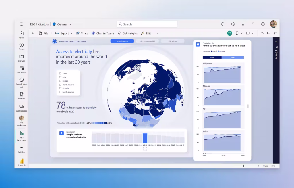
Microsoft Power BI offers deep integration with Microsoft products and advanced analytics capabilities.
Tableau excels at creating sophisticated visual analytics and compelling data stories.
Looker and Looker Studio provide strong data modeling through LookML and seamless Google ecosystem integration.
Domo delivers cloud-based collaboration features with extensive data connectivity options.
Comparing Core Capabilities Across Leading BI Tools
When evaluating BI tools, three core areas matter most. How well they connect to your data sources (do your research!), how they help you build interactive dashboards, and how they handle security and collaboration.
Each platform takes a different approach to these capabilities, which affects how well they fit your business needs.
Top 4 Data Visualization Tools
Data Connectivity, ETL, and Integration
Modern BI tools need to connect to multiple data sources without hassle. Tableau and Power BI both offer hundreds of native connectors for SQL databases, cloud platforms like BigQuery and Snowflake, CRMs, and marketing tools. Power BI has a significant edge if you use Microsoft products.
Google Looker Studio provides tons of connectors through its community marketplace, though many require third-party extensions.
Power BI includes Power Query for cleaning and transforming data before visualization. Tableau Prep handles data preparation as a separate product.
Finally, Domo claims to have lots of connectors and to be an easy low-code solution. That said, many clients come to us claiming Domo for is difficult to use, requiring coding capability.
Dashboard Creation and Interactive Visualization Options
Dashboard creation capabilities separate good BI tools from great ones.
Tableau leads in visual flexibility, letting you create virtually any chart type through its drag-and-drop interface. That said, I have never had an issue customizing a Power BI visual to my desired specifications. Power BI also has a robust custom visual marketplace.
Both tools allow you to click any element in a chart to filter related visualizations instantly, making data exploration intuitive.
Google Looker Studio makes dashboard creation simple with templates and a familiar Google-style editor. While it lacks some advanced features, it handles most marketing and business reporting needs.
Collaboration, Security, and Governance Features
Data security becomes critical when sharing dashboards across teams. Power BI and Tableau both support row-level security, letting you control which data users can see based on their roles.
Power BI’s RLS setup works through simple rules in the desktop app. Tableau implements this through user filters connected to your database.
Google Looker Studio offers row-level security only in the paid Pro version. The free version requires manual filter setup for each user group, which becomes tedious at scale.
Data governance features vary widely. Power BI provides centralized management through the Power BI Service, where admins control access, monitor usage, and set data refresh schedules.
Tableau Server and Tableau Cloud offer similar capabilities with detailed permission controls.
Collaboration tools differ by platform. Power BI integrates with Teams for real-time discussions around reports, which is a huge plus.
Tableau lets users comment on dashboards natively and get automated alerts. Looker Studio allows Google-style sharing where you control view or edit access through links.
For enterprise needs, both Power BI and Tableau offer audit logs, certified datasets, and data lineage tracking.
Pricing Models and Total Cost of Ownership
Data visualization tools use different pricing structures that affect your total costs.
Tableau tiers include Creator ($75–$115/mo) for developers, Explorer ($42–$70/mo) for self-service analysis, and Viewer ($15–$35/mo) for dashboard consumption.
Power BI, on the other hand offers completely free desktop developer access, Pro at $14/month (allows sharing), and Premium Per User at $24/month for higher computer and features. Finally, they have dedicated capacities that provide dedicated compute versus shared resources.
Looker Studio is slightly cheaper with creating being a free tier. Looker Studio Pro costs $9 per user/project/month and is required for better governance and features.
Domo’s pricing is not readily available but is known for being the priciest of those discussed in this article.
Regardless of selection, factor in training time, integration expenses, and potential consultant fees for setup. Some platforms like Domo require technical expertise that adds hidden costs through extended implementation periods.
Conclusions
In my opinion, these are the Top 4 data visualization tools out there, and after years of working with them, Power BI is my “go to.” For me, there are a few things about Power BI that make it standout. First, Microsoft is the “800-pound gorilla.” They invented SQL server and obviously, their tools play nicest together.
Next, the online community for Power BI is robust. If you have a problem or question, someone else has already asked it and posted about it in forums. I found the available help and documentation on other tools very limited by comparison.
Finally, Power BI gets upgrades monthly. As part of the forums, users can submit suggestions for upvoting and Microsoft tries to accommodate. It is impressive that essentially every month there are new features and toys making it a constantly improving piece of software.


